Marshall Meier received an award for his recent Emerson Exchange presentation, Improve How You Visualize Data. I first met Marshall at last year’s Exchange after I discovered we both did presentations on social media, a.k.a. Web 2.0. Here was last year’s summary of his presentation.
In this year’s data visualization presentation, he shared ideas from preeminent thought leader, Edward Tufte, and his seminal book, The Visual Display of Quantitative Information. Another thought leader Marshall highlighted was Stephen Few, who wrote several books on data presentation, including Show Me the Numbers.
When presenting, your focus should be on just showing the data. Don’t clutter it with extraneous visual information. Why does this matter? Your data is important. It helps you and those with whom you share this data better understand problems and make decisions. The goal for an excellent graph or chart should be to get the viewers of this data to ask questions.

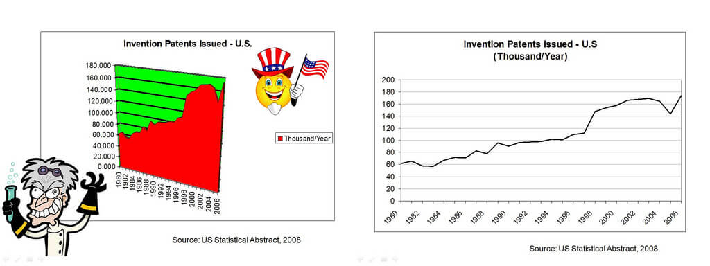
Marshall showed the same information presented in both a cluttered and clean presentation. The first view might prompt more thoughts about mad scientists than about the rise and fall of U.S. patents over time. Presentation viewers are more likely to engage in a conversation about the data with the simple uncluttered presentation.
One of Tufte’s ideas Marshall shared was the data-to-ink ratio. This is the amount of ink devoted to the data compared to the total ink used in the graphic. For a PowerPoint presentation, think pixels instead of ink. The higher the ratio, the more you’re focusing the visual display on the data.
Marshall described “chartjunk” as additional graphics not related to the data in a quest to make the chart more aesthetically pleasing. Instead, it distracts from the data. If you think your graph is boring, you’re showing the wrong data. Open a USA Today newspaper and you’ll find examples of chartjunk–like a gas price tracker that shows a gas pump graphic with a window containing the average price and another containing the directional price change. Although cute, the data-to-ink ratio is low.
Another example Marshall shared is the comparison between the main Yahoo page and Google page. They are at opposite ends of the visual display spectrum.
For those that love the visually exciting, 3D graphics in Microsoft Office products like Word, Excel, and PowerPoint, Marshall’s simple message is, “Don’t use 3D.” Although it may look cool, the 3rd dimension does not add anything. When the graph has multiple data series, 3D makes it difficult to compare data between two data points. In 2D, comparisons are easier to make. Again, the focus shifts from the “eye candy” to the data itself.
You can also fall into the trap of distorting the data. The concept of “lie factor” is the size of the effect shown in the graphic divided by the size the effect in the data itself. Graphic treatments that show a 3D-perspective can visually distort the data. Bar charts often convey size, relative differences, and area better than pie charts do.
Marshall closed his presentation with a famous graph described by Edward Tufte:
Probably the best statistical graphic ever drawn, this map by Charles Joseph Minard portrays the losses suffered by Napoleon’s army in the Russian campaign of 1812.
It shows you can use creativity and “eye-candy” if it amplifies the data and not the extraneous. Congratulations, Marshall, on a very informative, award-winning presentation!


